- Collection : Histoire de l'écriture typographique
- Thèmes : Culture Typographique, Histoire de l'écriture, Monographies typographiques
- Nombre de pages : 240
- Format : 21 x 29 cm
- ISBN : 978-2-911220-39-5
- Prix : 45,00 €
Tout connaître de l'homme à l'origine de l'univers visuel de la France des Trente Glorieuses
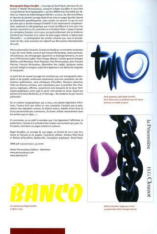
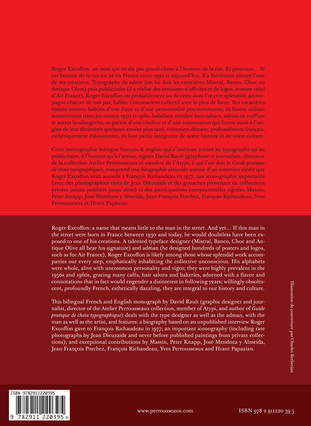
Roger Excoffon : un nom qui ne dit pas grand-chose à l’homme de la rue.
Et pourtant… Si cet homme de la rue est né en France entre 1930 et aujourd’hui, il a forcément côtoyé l’une de ses créations. Typographe de talent (on lui doit les caractères Mistral, Banco, Choc ou Antique Olive) puis publicitaire (il a réalisé des centaines d’affiches et de logos, comme celui d’Air France), Roger Excoffon est probablement un de ceux dont l’œuvre splendide accompagne chacun de nos pas, habite l’inconscient collectif avec le plus de force. Ses caractères étaient entiers, habités d’une force et d’une personnalité peu communes ; ils furent utilisés massivement dans les années 1950 et 1960, habillant nombre bars-tabacs, salons de coiffure et autres boulangeries, se parant d’une couleur et d’une connotation qui furent aussi à l’origine de leur désintérêt quelques années plus tard ; volontiers désuets, profondément français, esthétiquement éblouissants, ils font partie intégrante de notre histoire et de notre culture.
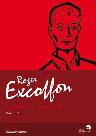
Cette monographie bilingue français et anglais, qui s’intéresse autant au typographe qu’au publicitaire, à l’homme qu’à l’artiste, signée David Rault (graphiste et journaliste, directeur de la collection « Atelier Perrousseaux » et membre de l’Atypi, à qui l’on doit le Guide pratique de choix typographique), comprend une biographie articulée autour d’un entretien inédit que Roger Excoffon avait accordé à François Richaudeau en 1977, une iconographie importante (avec des photographies de Jean Dieuzaide et des gouaches provenant de collections privées jamais publiées jusqu’alors) et des participations exceptionnelles signées Massin, Peter Knapp, José Mendoza y Almeida, Jean-François Porchez, François Richaudeau, Yves Perrousseaux et Hrant Papazian.
Recommandé par le site typofonderie.com :
http://typofonderie.com/gazette/post/roger-excoffon-a-part-of-the-mythology-of-french-typography/
En cours de traduction en italien.
Roger Excoffon: a name that means little to the man in the street. And yet… if this man in the street were born in France between 1930 and today, he would doubtless have been exposed to one of his creations. A talented typeface designer (Mistral, Banco, Choc and Antique Olive all bear his signature) and adman (he designed hundreds of posters and logos, such as for Air France), Roger Excoffon is likely among those whose splendid work accompanies our every step, emphatically inhabiting the collective unconscious. His alphabets were whole, alive with uncommon personality and vigor; they were highly prevalent in the 1950s and 1960s, gracing many cafés, hair salons and bakeries, adorned with a flavor and connotations that in fact would engender a disinterest in following years; willingly obsolescent, profoundly French, esthetically dazzling, they are integral to our history and culture.
This bilingual French and English monograph by David Rault (graphic designer and journalist, director of the Atelier Perrousseaux collection, member of ATypI, and author of Guide pratique de choix typographique) deals with the type designer as well as the adman, with the man as well as the artist, and features: a biography based on an unpublished interview Roger Excoffon gave to François Richaudeau in 1977; an important iconography (including rare photographs by Jean Dieuzaide and never before published paintings from private collections); and exceptional contributions by Massin, Peter Knapp, José Mendoza y Almeida, Jean-François Porchez, François Richaudeau, Yves Perrousseaux and Hrant Papazian.
Soon to be translated into Italian.
Roger Excoffon: un nombre poco conocido por el hombre de a pie.
Y sin embargo… Si ese hombre de a pie nació en Francia, entre 1930 y hoy, se ha codeado sin lugar a dudas con alguna de sus creaciones. Tipógrafo de talento (se le deben los tipos Mistral, Banco, Choc o Antique Olive) y posteriormente publicista (realizó cientos de carteles y logotipos, como el de Air France), Roger Excoffon es probablemente una de esas personas cuya espléndida obra acompaña nuestros pasos y se ha instalado sólidamente en el inconsciente colectivo. Sus tipos eran firmes, de una fuerza y personalidad poco comunes; se utilizaron mucho en las décadas de 1950 y 1960, en muchos bares-estancos, peluquerías y panaderías; tenían unos colores y una connotación que causaron su desinterés años más tarde; anticuados, profundamente franceses, de una estética abrumadora, forman parte de nuestra historia y de nuestra cultura.
Esta monografía bilingüe inglés-francés se interesa tanto en el tipógrafo como en el publicista, en el hombre y en el artista. Está firmada por David Rault (grafista y periodista, director de la colección «Atelier Perrousseaux» y miembro de la Asociación Tipográfica Internacional - Atypi, a quien debemos la Guide pratique de choix typographique). Comprende una biografía redactada a partir de una entrevista inédita concedida por Roger Excoffon a François Richaudeau en 1977, una importante iconografía (con fotografías de Jean Dieuzaide y gouaches de colecciones privadas que nunca se habían publicado) y la participación excepcional de Massin, Peter Knapp, José Mendoza y Almeida, Jean-François Porchez, François Richaudeau, Yves Perrousseaux y Hrant Papazian.
Pronto se traducirá al italiano.
Sommaire
Introduction
1910-1945 : L’apprenti
1945-1959 : Le typographe
1959-1983: Le publicitaire
L’album Jean Dieuzaide
Souvenirs et réflexions
Annexe
Sources
Remerciements - L’auteur


